Data blending is now available in Data Studio! One of the most heavily requested features just launched and truly enhances the power of Google Marketing Platform Data Studio that much more.
Have you ever wanted to combine multiple Google Analytics Views or join Google Analytics with Salesforce data directly in Data Studio? The power of data blending is now in your hands. You can now combine multiple data sources directly in the Data Studio UI and visualize your results in one single chart.
What is Data Blending in Data Studio?
Data Blending is the ability to ‘blend’ or ‘combine’ multiple data sources into one single chart or graph in Data Studio. A common use case you may be familiar with is having multiple Google Analytics Views setup for your website. You may have a Desktop and Mobile only GA View and you would like to see that data combined into one singular graph so you can easily consume both data sets rather than having multiple visuals from both sources in the same report.
In order to blend multiple sources together each data source must contain a “join key” which is a commonly shared dimension amongst both data sets. Data Studio will try and automatically detect a join key for you and if it is unable to detect a join key you will see that the join key says “Missing” in the Data Blend Panel, but you can manually change if needed. And do note that all blends in Data Studio are left outer joins.
Also note that when creating blends you have to manually set up which dimensions and metrics you would like from each source, it does not join the entire data sources as a whole.
How do I Blend Data in Data Studio?
There are currently a few different ways to go about blending data and depending on your needs one may be easier than the others.
Option 1 – Manage Blended Data
Step 1 – Create New Data Blend
What may be the most familiar option when managing data sources is to use the “Resource” menu from the top of your Data Studio report to access the new feature “Manage blended data”.
From this new screen you will be able to setup a new blend (which is currently labeled as “Data View”) by clicking on “ADD A DATA VIEW”


Step 2 – Add Multiple data sources
You will be taken to a new screen where you will setup your blend by choosing multiple data sources from either existing sources added to the report or by adding new data sources. Simply choose your first data source to start your blend.

Step 3 – Add Dimensions, Metrics and additional data sources
When setting up your blend you need to specify exactly which metrics and dimensions you would like to have. This does not blend the entire data sources together. To choose your metrics and dimensions, start dragging them from the list of “Available Fields” to the “Fields to include in data source”. Very similar to the drag and drop functionality when editing a visualization in your Data panes today.
*Note that since all blends are left outer joins, depending on what data you are joining can dictate which data source you setup first as it will be the ‘left’ data source of the join. You can also change this later if need be.
Once you have added your metrics and dimensions for your primary left data source you can then select “ADD ANOTHER DATA SOURCE”

After adding your secondary data source you will need to follow the same steps by adding your dimensions and metrics needed by dragging from right to left for this new source. You’ll also see that a new option is available to dictate what your join key is. Data Studio will try to automatically choose the best join key for you, but you do have the option to manually edit.

Step 4 – Review your Blend and Save
The right hand side of the “Blend Data” screen will allow you to name your blended data source, preview your dimensions and metrics, and allow you to save. If it all looks good, click save and create your first blended data source!

Step 5 – Create Visualizations with your Data Blend
Now that you have your new blended data source you can create a visualization like normal and choose this new blend from the Data Pane when selecting your source.

Option 2 – Blending Multiple Existing Visualizations
Step 1 – Create two or more visualizations that are identical to each other but use different data sources
In our case we created 3 tables that contain Sessions for the months of January – June from three Google Analytics Views: Desktop View, Mobile View, and Tablet View. This is something common you may have in existing reports if you’ve ever tried to show data from multiple Google Analytics Views at once. Now we can combine them into one single table.

Step 2 – Shift Select your visualizations and then Right Click and choose the “Blend Data” option at the bottom and a new single blended table will be created.


Step 3 – Edit Blended Visualization if Needed
In our case since we combined three tables that all contained the metric “Sessions” our resulting table has three columns all labeled “Sessions” and we now need to relabel them to make sense of the Table.
In typical Data Studio fashion there are several ways to go about this. You could simply select the blended visual and rename the metrics from the right hand “Data Pane”, we could select the visual and choose to edit the blended data source and relabel each metric from here, or even access this same window by going to Resource > Manage blended data > Edit Your Blend. But honestly it’s probably easiest to just select your visual and rename your metrics from the “Data Pane”.


Option 3 – Blend to an Existing Visualization
Say you have an existing report with some tables that you’re just dying to add some additional data to. In this case you can select your visual and in the “Data Source” section of the “Data Pane” you can click on “BLEND DATA” which will take you to the “Blend Data” window seen in the previous steps where you can then setup your blend the exact same way. Note that after clicking Save on this new blend, your visual will automatically update and start using the blend as the data source.

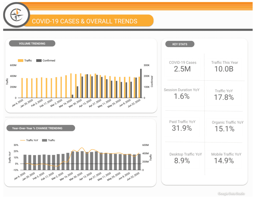
Example Data Studio Report

How to Edit Your Data Blends
Once you have created your data blends you do have several edit options on the blend itself. By clicking on your blended visual and then clicking on the Pencil/Edit icon next to your blended data source you can bring up a new Blend Data Panel at the bottom of your screen.
This screen will look pretty familiar as it mirrors pretty closely the Data Pane you may already be familiar with.

Example Data Studio Report – Blending Google Analytics and Salesforce
We’ve previously talked about the need for companies to be able to track and blend Salesforce and Google Analytics data together.
In our example we discuss how to capture the Google Analytics Visitor ID directly in Salesforce to provide a deeper analysis on your customer’s journey through your website.
Using the new Data Studio Blending feature you can easily take an export from Salesforce and blend it with your Google Analytics Visitor ID!

Conclusion
The long wait is finally over and data blending is now available in Data Studio. The possibilities are endless and hopefully this makes everyone’s analysis in Data Studio that much better!