 When working with high volume sites, slicing and dicing the data can be challenging, and looking for insights is very much like Tom Hank’s famous quote from the movie Saving Private Ryan – it’s like “finding a needle in a stack of needles”!
At E-Nor (now Cardinal Path), we’re proud to work with some of the most recognizable brands in the world. Our clients expect sophisticated measurement and deep insights, more than “ancient” basic metrics like “total visits” or “site wide conversion rates” :).
So what do you do? One thing I’ve learned over the years (the hard way at times!) is that as a consultant, and the same applies to marketers and practitioners, you should focus on what matters most to the business. Find creative ways to measure/report/analyze and find “gems” that truly impact the business. Along the way, that will make you look like a hero (and will ensure long-term employment!).
In this post, I’ll cover the challenges and solutions for understanding user behavior and cohort analysis across multiple platforms. The business we’re using as example is a large media organization where you “Sign Up” to access content. You then have the option to upgrade and buy a “Premium Subscription” as well as access to buy exclusive products and services. And in case you are just getting used to this type of analysis, a typical cohort analysis will show you the behavior of a “class” of visitors, typically segmented by an action on a specific date or date range.
We’ll cover:
- The Cross-Platform Challenge
- The Measurement Approach
- Integrated Reporting & Insights
1- The Challenge – Web, Mobile and Offline
In this multiple device, multiple platform world, understanding user behavior and measuring “what matters” require planning (and a bit of process) way before jumping into tagging and JavaScript. Especially as we start shifting our thinking from measuring visits and conversion rates, to visitors and customer lifetime value. I won’t get into the technical instrumentation of cohort analysis (just Google it, you’ll find many posts on the basic “how-to”). I’ll focus on the user-centric approach and marketing insights.
“Out of the Box” Cohort – Mixpanel Analytics
Some analytics tools have cohort analysis built in their standard reports. For example, you could be using the Mixpanel platform (and assuming you’ve planned and implemented your events properly), you’ll get very meaningful cohort reports that can shed some light on user behavior over time. Say you have a content site where a subscription to access is required, you’d want to know if your users are coming back and consuming that great content you produce, if a cohort of users whom you acquired in a specific time period, are likely to be more loyal than others.
A standard Mixpanel cohort report will look like the snapshot below:
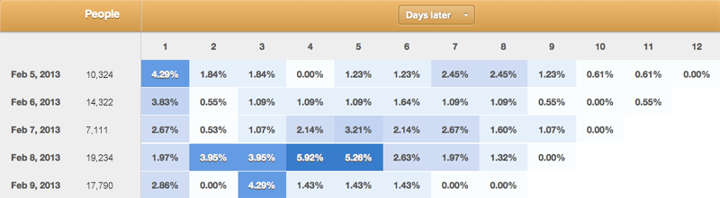
The first column shows the date at which the “Sign Up” occurred. The “People” column shows how many people signed up on that day (e.g. 10,324 on Feb 5th, 2013) and the percentages represent the percent of people who come back after x-amount of days (where x is 1 to 12 in this chart). So for the Feb 5th cohorts, 1.84% of them came back and consumed more content two days after signing up.
In addition and without a lot of digging, you can clearly see that the segment of visitors who signed up on February 8th are super engaged in the first seven days, and they are coming back for more every other day. On the other hand, those who signed up on February 6th, behave completely different. They are interested initially and then their interest taper off.
Campaign Segmentation in Mixpanel
You are hungry for more insights, what do you do? Jump over to Mixpanel’s Segmentation reports (you can segment on the fly by region, referral and even Google Analytics utm parameters) and dig deeper to find the source of those who signed up on the 8th. You’ll notice here that the campaign that peaked on the 8th (in green) is likely to be a very good driver of such an engaged audience.
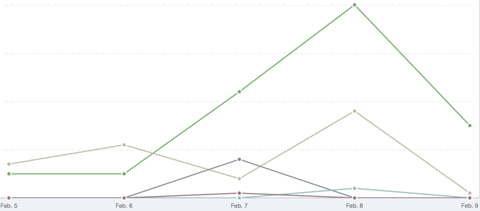
That’s good to know, but you are still not yet satisfied. The data above is from the web channel only. You are missing other acquisition channels.
In line with our cross-platform and the 360-degree customer view approach, let’s take this analysis to the next level for a large media site. Visitors register to access and share content, and with a paid “Premium Subscription” option then have access to discounted/exclusive products and services. You’d want to track user behavior across all potential channels on which a prospect might convert. A prospect can buy a Premium Subscription:
- On the website
- On their mobile app
- Dial the 800 number and sign up “offline”
2- Solution Design – Analytics & Measuring Across Platforms
This large media site uses Google Analytics Premium and also has Flurry Analytics for their mobile app. But no matter what analytics platform you are using, this multiple-way conversion presents quite a challenge to cohort analysis in any one analytics product. Time to stitch and tie!
To have the 360-degree view of the customer, and stitch all the disparate data from the web, mobile and offline, there is a technical implementation aspect and a little bit of process. So yes, work is required, but the anticipated results are definitely worth all this pre-requisite hard work.
The highlights of what is needed include:
- Web data — extract data from Google Analytics Premium
- Mobile data — download your events data from Flurry
- Offline — export your purchase data from your backend
And here are the details:
Web Analytics: Google Analytics Premium unsampled reports with the following metrics/dimensions:
- Revenue
- Date of transaction
- Cohort date – The date the Premium Subscription took place, and is stored in a visitor-level Custom Variable 1
- Unique customer ID, (of course, no personally identifying information), stored in visitor-level Custom Variable 2 (we will use this for the advanced user-centric tip at the end of the post)
Note: As previously stated, this is not a technical post, but here is how you’d set up Custom Variables. You’ll also need the help of your IT/dev team to coordinate the passing/managing of the unique ID in the backend system.
In Google Analytics, run an eCommerce -> Sales Report, and choose your Cohort date (CV1) as a secondary dimension, you’ll have something like this:
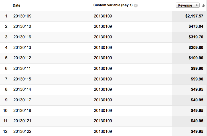
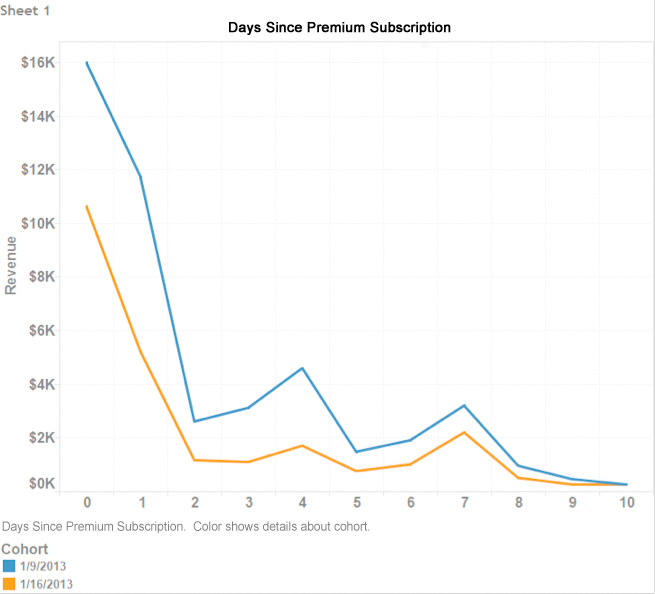
The table above shows the dates/revenue after the Premium Subscription date (e.g. CV1 = 20130109, January 9, 2013) during which a transaction took place, along with the revenue associated with these transactions. Now, say you want to see how the January 9th cohorts did compared to the January 12th cohorts. , Simply create an advanced segment for each of the Cohort dates and the graph will look as follows:
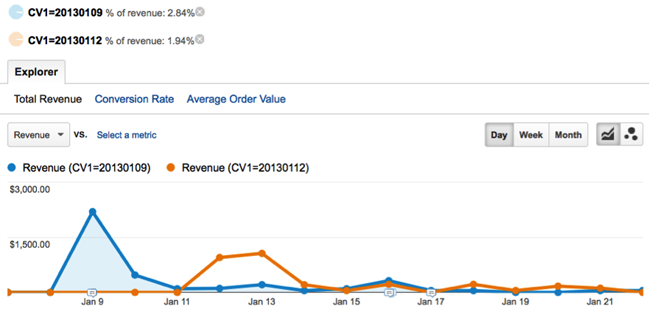
Here are the findings:
- The January 9th cohorts brought in 2.84% of the revenue
- The January 12th cohorts brought in 1.94% of the revenue
- There were no more sales from either cohorts after January 21st
Once the “Cohort date” data has been collected, you can also plot it in Excel or Tableau in a traditional cohort chart. We will cover this later in the post.
Before we move on to more analysis, insights and actions, we still need to complete the picture. Remember, our subscribers can upgrade to a Premium Subscription using the mobile app as well. So let’s take a look at the mobile data next.
Mobile Analytics Data – Flurry Analytics come to the rescue
This client is an early adopter of mobile and has leveraged the powerful capabilities of Flurry Analytics since day one. The client has done their homework and planned out their user actions (aka Events) and did not just settle to track screens and buttons, but is also tracking outcomes like In-App Purchases (IAPs).
Similar to what we gathered from Google Analytics, in Flurry Analytics we want the following information:
- An event when the Premium Subscription purchase takes place, date stamped for our cohort analysis (e.g. 20130109)
- Revenue associated with purchases
- Unique user ID (and again no PII please!). The user ID will show in your Flurry Event Log (we will use this for the advanced user-centric tip at the end of the post)
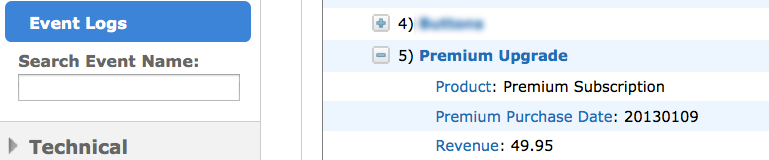
As you see in the image above, your “time stamped” mobile app eCommerce data is now available.
We can create a segment in Flurry under Manage –> Segments and choose the Premium Purchase Date as the custom event/parameter for the segment, and then export this data (download as CSV or leverage the Flurry API). If you are downloading the CSV, your parameters (revenue, etc.) will be available in one cell in Excel, and you can easily parse the parameters you want to include in the report.
Offline – Backend Data
Well, we are almost there! Since the client’s system allows for offline Premium Subscription upgrades as well, we need this offline data integrated too. These elements are required from your backend:
- Premium Subscription date
- Date of purchase
- Revenue
- Unique customer ID
And finally, we download the offline data in a CSV file, and we are ready to rock and roll!
Note: if you are forward thinking and like to get your hand into the latest and greatest, then Universal Analytics (from Google Analytics) will be an option here. With Universal Analytics you will be able to import the offline user interactions into Google Analytics and map it to existing data.
3- Integrated Reporting – Customer 360-View, Tableau Dashboarding & Insights
If you’re using a data warehouse or a database one approach would be to present all this data in Tableau using its optimized connectors available for many data environments. If you haven’t made the investment into your infrastructure yet, or you don’t have the IT resources to leverage these connectors in Tableau, you could extract your data into CSVs from Google Analytics Premium, Flurry and your backend system and upload it into Tableau.
Now that you have your data ready from the three data sources (web, mobile and offline), it’s time to tie it all together, visualize, analyze and find some awesome actionable insights. Your common element for this analysis is going to be the Premium Subscription Date.
Aha! The cross-platform full picture is ready for you. You see the value of those who signed up on the 9th of January (in terms of sales and revenue), and you start understanding where they came from, what offer resonated with them among other factors.
Advanced Tip# 1 – Google Analytics Tableau Integration
If your business is a pure online play, and your subscribers can only buy on the website, I have a very nice surprise for you (kept this till the end to reward the loyal readers :)). With Tableau version 8, there is a native integration between Tableau and Google Analytics (in beta but works well), meaning you can pull your dimensions and metrics directly from GA and into Tableau. You bypass the need to download files, reformat and upload. I’ll share the tips on doing so in a post by our Tableau geek extraordinaire Shiraz in the next few days. (Please note if you have a large site with high volume and you are getting sampled reports, this method will not work for you. For now, you’ll have to download the unsampled reports and then upload into Tableau).
Advanced Tip# 2 – User Centric Analytics
In-line with our emphasis on concepts such as user-centric analysis (and Universal Analytics), and in capturing data from different sources, I emphasized the need to include a unique user ID when customers buy the Premium Subscription. Once you have this common user ID (aka key) you can run all sort of sophisticated analyses in your Tableau or a BI tool of your choice. Examples include:
- Customer Lifetime Value (LTV)
- Recency & frequency across platforms (web, mobile, offline)
- Segment high ticket item customers
- Map demographics data (available in Flurry and/or your backend system) with web data
- Plus more and more scenarios that I’ll leave for future posts
So there you have it, how to create a cohort analysis across mobile, web and offline platforms. I hope you found this post useful and I look forward to hearing your comments and input!