John Hossack recently sent me a link to www.dumoulin.com. Included with the link was a challenge: “Try to check out”.
I'm always up for a game. Mysteries, puzzles, codes… I love them all. And as I soon discovered, dumoulin.com is teeming with them!
First thing I did was open a product description page. Notable by its absence was a link or button reading “Add to Cart”. But I did spot an icon depicting an arrow pointing into a shopping cart. Ahhh… secret code. Very clever!
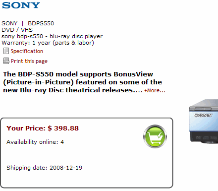
I clicked the lovely green icon and sure enough, a pop-up told me the item had been added to my cart. Great, I thought. First level successfully completed. This game's easy!
Next I decided to check out. Naturally enough, I looked for a Checkout button… and didn't see one anywhere. Can you find it?
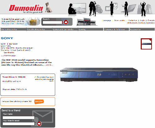
Yes, this puzzle's a bit harder. Most likely, you're looking for another “secret code” icon, right? Sorry, but the designers were more clever than that: they've changed the nature of the game. It's no longer code, it's camouflage!
Look carefully at the top left of the screen and you'll see a tiny blue-on-patterned-blue text link to “Modify my order / Checkout”:
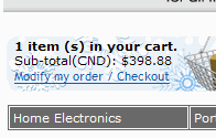
Subtle, eh? Not to mention tasteful. And we're only on the second level of this challenging game. Or are we? Even the order status is wonderfully mysterious. Later in the game, I examined my progress indicator. Note that it seemed to indicate I was… between steps?

Warning: Spoilers Ahead
There's much more to this site, but I think you probably get the idea by now: visitors are treated to all manner of puzzles and secret codes. There's:
 | “Update Cart” |
 | “Submit” |
 | “Remove from cart” |
And one of my favorites:
 | “Cancel/Submit” |
Many thanks to John for leading me to this site. It provided many long minutes of challenge and entertainment. More importantly, it's a wonderful example of how you can minimize those pesky conversions by forcing your customers to work unnecessarily hard. After all, why just “say it” when you let your visitors figure stuff out?


