In the previous instalment of “The math behind web analytics” we discussed some pretty basic elements: averages, trends, min & max, standard deviation. Then we touched on normal distribution and histograms.
Download the Excel companion file for this article: MetricsAnalysis_110907.xlsx.
Learning from Finance
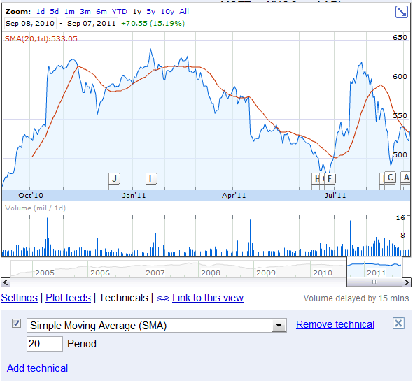
Back in the days I worked at the Montreal Stock Exchange I had to take some stock trading classes. This is where I learned about moving average, probably like anyone familiar with the stock market. The red line in the GOOG stock price is the simple moving average based on 20 periods – or 20 days in this case.
Another way of looking at it is through the Exponential Moving Average (EMA) – which basically puts some more weight at the most recent data. Investors use this to predict when it is time to buy or sell a stock – we can use it to predict if we should expect our metric to go up or down. This function is available in the Data Analysis pack of Excel under Exponential Smoothing.
The moving average
Conceptually, Wikipedia defines the moving average as “Given a series of numbers and a fixed subset size, the moving average can be obtained by first taking the average of the first subset. The fixed subset size is then shifted forward, creating a new subset of numbers, which is averaged. This process is repeated over the entire data series.”
And add “A moving average is commonly used with time series data to smooth out short-term fluctuations and highlight longer-term trends or cycles.”
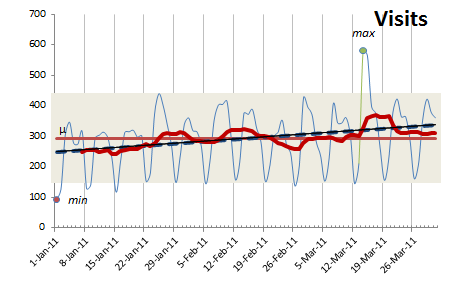
If we look back at the sample data used for the previous articles, we clearly see a weekday-weekend cycle with some peaks and valleys. Drawing the trend (dotted blue line) gives us a sense of growth. With the moving average set to seven days (darker red line) – because we know the cyclical pattern is repeating itself on a seven days cycle – we have a slightly different view of the growth.
If the default line graph is like looking at the trees of a forest, the average is akin to looking at the whole forest. The moving average is inbetween: we look at areas of the forest which are denser (higher or going upward), and others where there might be some clearing (lower or going downward).
Using the moving average gives us a better feel of the growth pattern than the default line graph, average or trend.
That’s it – now you have another way of visualizing your data!
Next: Box plots
I wanted to keep this post as short as possible; the next post will be entirely dedicated to the concept of box plots.
For a while, traffic from AI platforms like ChatGPT, Gemini, and Claude lived in an…
Our team is heading to San Francisco March 3-5 for RampUp 2026. We'll be meeting…
The rise of browser-based Opt-Out Preference Signals (yes, OOPS) is quietly reshaping online consent experiences.…
This website uses cookies.