Here goes the fifth in this series. We started with some basic stuff, then we reviewed proper use of averages, trends and standard deviation. We also looked at control limits, histograms and in my last post we explored moving averages.
This week I’m revisiting a topic which was immensely popular when I first published it in January 2007: a solution to draw box plots & whisker plots in Excel 2007.
Get the FREE MetricsAnalysis_110930.xlsx file which recaps everything from the previous articles, including basic stats, an histogram tool and a nifty box plot with automatic outliers detection!
A box plots are a quick visualization method used in statistics. They show, at a glimpse, several very important elements describing a data sample:
In addition, a box plot can help visualize two other elements:
This can be very handy in web analytics since box plots can easily reveal the limits of acceptable data and any outliers, they can be used to easily convey standard information but also highlight trends and abnormalities.
As with previous articles, you can download the Excel 2007 example of a fully working box plot and whisker plot graph.
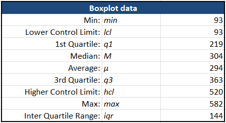
Boxplot data
Starting with our sample time series, we first calculate a number of useful elements to draw the boxplot: min & max, 1st quarter (q1), median (M) and 3rd quarter (q3), lower & higher control limits (lcl, hcl) and finally, the Inter Quartile Range (iqr).
Visualization
Drawing the box plot itself needs a little magic which would be too long to explain here, but the result is quite interesting.
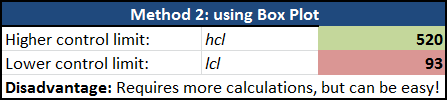
Control limits revisited
Using the box plot approach, we can review the way control limits are set so outliers are NOT influencing them. Basically, instead of just doing +/- of standard deviation, we use the Inter Quartile Range, which is basically the difference between 3rd quarter and 1st quarter of data. That is
iqr = q3 – q1
lcl = MAX(M – iqr * 1.5, min)
hcl = MIN(M + iqr * 1.5, max)
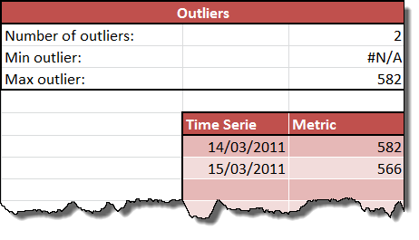
Outliers
The next interesting element is an automated identification of how many outliers there might be – either low or high, and the list of values. Those are also added to the box plot graph (however, this might need some manual tweaking of the graph).
As we’ve seen since the begining of this series, there’s a lot more to analysis than simply using the numbers our web analytics tools of choice provides us. Developing our analytical skills, what the data tells us and how we can slice & dice it is a cornerstone of the analyst role – the two others being a thorough understanding of the business and an awareness of the possibilities and constraints of the medium we’re using (the web, social media, etc.).
In June of 2008 I published the first version of a sample dashboard for Excel 2007. It became immensely popular as a learning example and I received lots of feedback from practitioners, independant consultants and agencies telling me they were using it in real contexts – although it was really built as an example. So now that we have some background, we’ll be able to move to the next stage: developing powerful analytics dashboards in Excel!
Our team is heading to San Francisco March 3-5 for RampUp 2026. We'll be meeting…
The rise of browser-based Opt-Out Preference Signals (yes, OOPS) is quietly reshaping online consent experiences.…
We’re thrilled to announce that Merkle Americas has officially agreed to become the platform’s first-ever…
This website uses cookies.