Google Analytics just announced a new group of reports that they are calling “Flow Visualization”. This is different than the term all of us are more familiar with, which is “Path Analysis.” The reporting tools and reports that most of us use today are very difficult to gain insight from. “Flow Visualization” has just raised the bar, it may have even replaced the bar entirely. “Flow Visualization” is a new way to understand how visitors flow through your website, and uses intuitive imagery combined with powerful segmentation abilities to aid insightful analysis. Google Analytics is in the process of rolling out these reports to all users, and I can’t wait for you to get them!
Terminology
Before we begin looking at these reports it is important to understand what we are looking at. Each flow page will have nodes. The node is simply a segment of visitors. These nodes represent some feature of the visitors, such as traffic sources, new visitors, browsers, etc. The connections represent the number of visitors that went from one node to another. Red connections are those who left the site. The size of the nodes and the connections are proportional mean smaller numbers will have smaller numbers and larger numbers will appear larger. This makes it extremely easy to see these flows. The image in the next section illustrates the nodes and the connections.
Goal Flow and Control Panel Overview
The first new flow report, the “Goal Flow” report will be a welcome addition to the Conversion section in Google Analytics. The image below shows this report, I highlighted the connections, nodes and segmentation capabilities. The first dropdown in the purple box, will allow you to select which goal you would like to be presented. The “Select a segment” works just like the “Advanced Segments” feature. You can pick any of the pre-existing segments, such as returning visitors, or you can create your own segment such as branded keywords. The flow reports by default only show significant sources of connections, but you can show more by dragging the connections slider, which is in the purple box. You can also change “source” which is the default view, to a variety of other dimensions, including city, keyword, browser, and more.
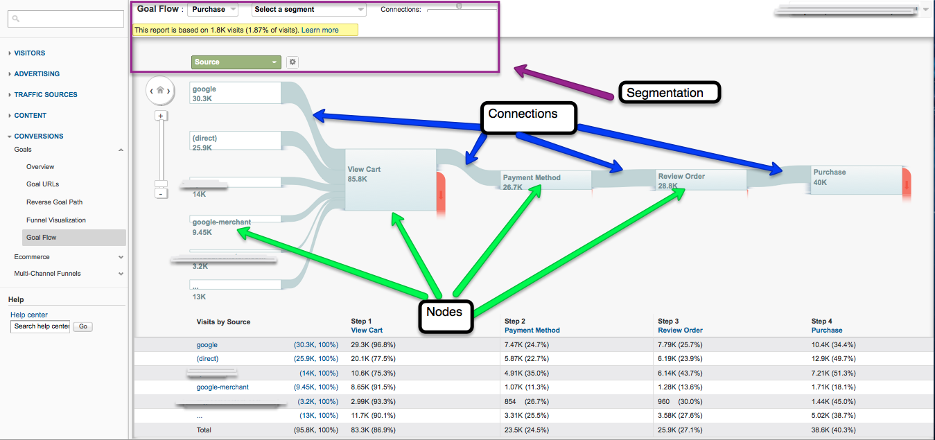
For this “Goal Flow” report, I have shown a purchase funnel. We can see the sources on the left side and each step in the funnel following on the right. For each dimension, the report will show the top five and then group the rest in a sixth entry. The steps in the “Goal Flow” all come from the goal funnel you define in the profile settings. Only URL destination goals are supported at this time, not event goals. The table at the bottom of the graph shows the numbers of visitors that make it to each step. This is extremely useful as you can use this to address issues. For example if you use the browser dimension, you might see a huge decrease in mobile users that reach the purchase page. This would suggest that your site might need some mobile optimization. The best part is if you don’t have a goal or goal funnel setup, you can create one and it will use your data to populate the report as if it had been there all along.
Visits Flow
Next up is the new “Visits Flow” report. This looks very similar to the “Goals Flow” report. The image below shows this report with purple boxes calling out important information. This report can be accessed by clicking the home button icon in the main toolbar from any area in Google Analytics. Below is the default view for this report.

When you first open this up it may appear to be a bit overwhelming. It is quite easy to start digging for insights. You can click on any of the nodes under the dimensions (“Source” is show in the image above) and show only connections from that node. You could do analysis coming from any of the dimensions. You can also click on any of the pages nodes and select either traffic from or through the node. The image below shows traffic through one of our blog pages. You can see the pages they came from and went to and add steps to previous or next pages that most of your visitors came from or went to.

The “Navigation Flow” report lets you group pages by regular expression. You could group all pages that contain a common word as an example, which is extremely useful for websites that are promoting different products. Let’s say you sell Apple and PC products, you could group them separately and compare common dimensions that bring them to the site or group them together and also understand how they view your site as a group.
Final Thoughts
Path Analysis has not been easy to do and gaining insights can be a painful process. Google Analytics has clearly spent a lot of time on these reports and it has shown. Flow Visualization makes seeing common trends and gaining insights significantly easier. The “Goal Flow” report is my favorite, and the segmentation combined with the running table at the bottom makes it painless to see what is going on with a variety of metrics. This is what differentiates it from all other competitor’s offerings. Google is truly making it easier to visualize visitor data, which gives us a whole new view called Flow Visualization.