Dashboards and Key Performance Indicators (KPI’s) — are attributed to the glory of Optimization.
In my experience, I have seen the concepts of dashboards and KPI’s misinterpreted and often misunderstood. Concepts, often adopted as best practices, lack rigorous questioning about their underlying purpose and meaning.
This post isn’t about me recommending top KPI’s for you to measure — you will find plenty of those posts elsewhere. As you can likely assess, I’m not a firm believer in the universality of KPI’s.
At Cardinal Path, we continue to work with clients who dream of the perfect analytics dashboard. Successful dashboards have the ability to transform the way you interpret raw data — giving you insight and empowering confident decisions.
Recently, I was honored to be named a panel judge for the 1st annual Digital Dashboard Design Competition, organized by Sweetspot Intelligence. Several year ago, I also served as judge at a web analytics championship, sponsored by the Digital Analytics Association. Although the DAA contest was about analysis, the panel was surprised by the interpretation and deliverables submitted by the participants. We dubbed them “fatal flaws of analysis”. Judging this latest competition, I walked away with a couple of updated “fatal flaws” to share here.
Think “business” first
The premise of the contest was simple: “Design your best possible dashboard design, for the joint management of Earned, Owned and Paid media—in any industry or for any stakeholder of your choosing.”
Pro tips
- Understand your business. Analytics is a function of data, context, creativity and process. Eliminate any of those elements and your dashboard initiative will fail. Here, context takes all it’s meaning. Understand the business you’re in, the internal politics of your organization, the complex ecosystem of your competitive environment, your organizational strengths & weaknesses, and of course, your digital analytics maturity.
- Understand your audience. Just like your marketing audience, you need to understand who will consume your dashboard. Are they data savvy and require autonomy and flexibility, or do they only need a snapshot of the insight?
- Segment and simplify the view. Any visualization should provide views of traffic sources based on Earned, Owned or Paid channels. This is a strong requirement and an indication that other types of segmentation are likely unnecessary.

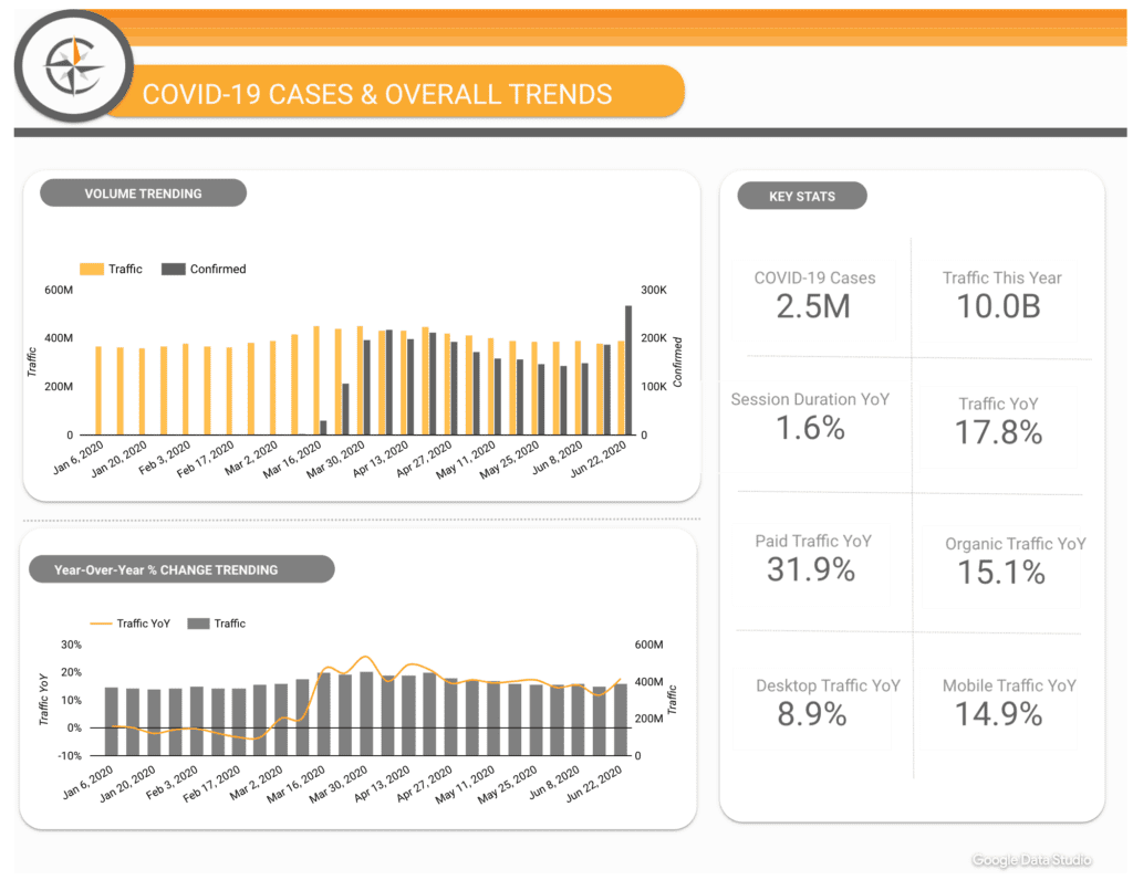
Example from a dashboard design competition participant
Visualization is a balance between art and engineering
There are three types of required dashboards. I highly recommend not trying to build one universal dashboard, that tries to encompass all three types:
- Operational Dashboard: Empower business users with predefined visualizations and the ability to segment the data. Typically, this dashboard is more tactical-oriented and detailed.
- Strategic/Executive Dashboard: Typically, these dashboard should encompass a few but very critical KPIs, with a time period comparison.
- Analytical Dashboard: This is geared for the data-worker. It includes advanced requirements, such as ability to drill-down and slice & dice the data ad-hoc.
Pro tips
- Read the classic article “Common pitfalls in dashboard design” by Stephen Few. Once done, read it again. While you are at it, read some more.
- Don’t confuse style with purpose. It might be interpreted as controversial to say, infographics are a creation of marketers for marketing purposes. They should not be used as dashboards.

Example from a dashboard design competition participant. - The perfect dashboard doesn’t exist. Think of your dashboard as an agile, on-going project.
- “Release early, release often”. In order to deliver time to value with the dashboard design process, and allow you to uncover the “unknown-unknown” factors.
- Give yourself the “right to
faillearn”. Adjustments and evolving requirements are inevitable. - Pay attention to details and keep in mind “data is the issue”. Continue to educate stakeholders about data quality. Be transparent about arising issues, in order to preserve their trust in the data.
- Communication is key to success. At Cardinal Path, we like to apply “radical honesty” with our clients.
Key Performance Indicators
You will hear all kinds of recommendations to measure and regulate defining successful KPIs.
Many years ago, I read “Key Performance Indicators” (D.Parmenter) and it’s one of those books that resonated with me, all of these years later.
Pro tips
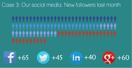
- KPIs come in pairs. For example, a ratio should also provide visibility over the underlying metrics. Don’t show $ value alone—reflect it by segment.
- KPIs provide context. For example, as a difference over previous period or a sparkline to highlight the trend.
- KPIs are calls to action. Use colors (red/yellow/green are universal stop-light indicators). As well, use indicators such as arrows to indicate increased or decreased performance levels. Proper indicators should trigger the question: “why are things changing?”.
- KPIs are aligned to targets. Needless to say, a target would be part of a rigorous SMART-goal definition. Worse case scenario, even a target established by consensus, even informally agreed upon, is better than no target. This creates a common understanding, a sense of progress and something to work against.
Analysts are informed storytellers
… and dashboards are there to facilitate that conversation.
It’s worth noting most of the contest participants proposed interesting dashboards with visual aspects, but most failed to clearly frame the context of the deliverable. It’s akin to the anecdote I use when teaching:
I asked students enrolled in a graduate-level class to comment the volume of traffic on SaveTheChildren.org. Many simply copied the graph, re-copied the total value to the decimal precision, cleverly calculated daily average… some mentioned the huge spike of traffic clearly noticeable. Clever students attributed this soar in traffic (at least tenfold!) to a very successful marketing tactic. Clearly, few actually looked at the home page at the time or listened to the news… the reason for this outstanding performance (sic!) was a major external event: the 2010 earthquake in Haiti.
I tell this story because it highlights many of the points discussed in this post. When building dashboards:
- Data alone is worthless. You need context to turn data into knowledge, and it needs to be actionable data to be considered insight.
- Tools can make you dumb. Limiting your ability to ask “why?” and think outside the box.
- Explaining the context and process— leading to insight—often has more value than the result itself.