In the third installment of this series, we will leverage Excel to continue where we left with Google Analytics.
- The math behind web analytics: the basics
- The math behind web analytics: avg, trend, min & max, stdev
Note: for sake of simplicity and ease of learning I’m using visits to my blog between January and March; the same concepts applies to any metrics. We voluntarily ignore seasonality and external factors. Real-life scenarios can be much more complex – but bare with me, we’ll cover that in a later post.
You should download the sample Excel file to follow along: MetricsAnalysis_110812a.xlsx
Defining success
When do you know if you are “over-performing” or “under-performing”? How do you determine which target to aim for? Setting objectives isn’t easy, setting good, achievable and realistic ones is even harder – probably one of the many reason why some people say web analytics is hard. To quote Jim Sterne, “how you measure success depends how you define success”. Success isn’t a metric. Success is the achievement of an intended, specific, measurable, attainable, relevant and time-targeted objective [wikipedia].
In the context of this series, the “measurable” and “attainable” attributes of a SMART objective are of interest – and control limits can help us.
Control limits
Once charted in Excel, the data looks like this, with a clear weekday/weekends cycle and some high/lows:
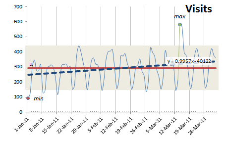
This graph shows the visits by day (with major gridlines on Saturdays), the average (in red), the trend (dotted blue), min & max values, as well as a shaded area representing +/- 1.5 x Standard Deviation. Basically, our upper and lower control limits [wikipedia].
Learning point: Control limits are used to detect data that indicate a process is not in control and therefore not operating predictably. Ultimately, we want to be able to predict that an increase of X% in our visits will result in a positive impact of Y% of our success metric.
Linear equation: Remember the linear equation y = mx+b? [wikipedia] Based on the current trend, I could forecast the expected number of visits in the future. That is, if there is no real seasonality or external factors, I have a natural progression – therefore, if I want to over-perform, I need to do better than y = mx + b. How much bettter? We’ll see. (we keep things simple at this time, in real life it’s not always that simple!)
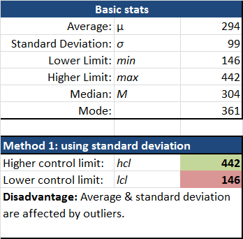
Six Sigma: Generally, when we have perfectly normalized distribution of our data [wikipedia], a controlled and highly predictable process, we would aim for +/- 3 standard deviations (represented by the “sigma” sign) – thus, Six Sigma [wikipedia]. This would represent 99.99966% of our data set… or less than 3.4 abnormal values (also called “outliers”) [wikipedia] per million data points! In our digital analytics world, because we’re not looking at controlled processes in a manufacturing environment, and because we’re not looking at perfectly normalized data of a standardized process, the six sigma rule doesn’t readily apply. However, I’ve found +/- 1.5 to be a pretty good starting point. The number you’ll want to use depends on fluctuations of data and how much control and predictability of that metric.
Histogram & normal distribution
You could rightly point out that using control limits and the +/- minus method is innapropriate because of a) our data is rarely normalized and b) it doesn’t account for the trend (i.e. in the 1st chart, notice min on the left and max near the right, a classic pattern when our data is trending upward).
Why isn’t this data normalized? Can it be?
In the attached spreadsheet you will see a tab called “Histogram”. An histogram is a visual representation of the distribution of data [wikipedia]. The default histogram for our sample data clearly isn’t normalized.
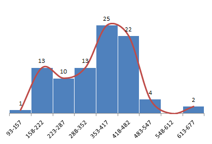
We don’t have a nice, bell-shaped curve – or a normal distribution… We see two distinct summits (one between 158-222 and another around 353-482). Why is that?
Segmenting, slicing & dicing the data is an essential skill of the web analyst.
Let’s make the hypothesis that weekdays traffic is significantly different than weekends – an easy assumption to make based on the look of our 1st graph. Once we clear the values for weekends in our sample data, we end up with this:
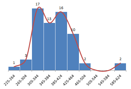

Look at that!
- We (almost) have a normal distribution, with most of the values between 305-464.
- There are more data points to the right of the median value (342 for weekdays), meaning we have an upward trend.
- The last two points are outliers (we will cover that in the next post).
Setting a measurable and atteainable objectives
Further analysis
- Any single data point falls outside our control limits: might be an abnormal or out of control situation.
- Nine consecutive points fall on the same side of the center line: some bias exist.
- Six (or more) points in a row are continually increasing (or decreasing): there is a trend
- Fourteen points (or more) in a row alternate in direction, increasing then decreasing: this much variance is not simple noise and both mean and standard deviation won’t be affected.
- Two or three consecutive points falls beyond half our control limit, on the same side of average: there is a chance of a trend emerging, an external event, or similar situation.
- Fifteen points in a row are all within one standard deviation: greater variation would be expected… if this metric is something you are trying to influence it doesn’t really work!
Your assignment!
Coming up: moving average and seasonality, using box-plots and doing more analysis!
As mentionned in the intro, I didn’t consider trending and seasonality factors in order to ease the learning and keep this post shorter… we’ll cover that with the help of moving averages and further analysis. Also, although nifty spinning 3D-graphs are impressive, box plots elegant simplicity are a powerful and under-used visualization tool!