world cup brazil 2014 tableau

The World Cup is the most viewed global event (yes, even more than the Olympic Games). Internationally, one of the most, if not the most, common sport is soccer (known as football in places other than the U.S.), and for good reason. Who can resist the fun of the sport! This year, there was the fastest goal scored by U.S. (32 seconds!), Algeria’s defense against Germany, and the mighty Tim Howard’s record-making game for most saves in a single game (16 saves people! 16!) — just to highlight a few!

The beauty of Universal Analytics is you can pull in any sort of data into the Google Analytics interface. To demonstrate this, in our last post, we pulled World Cup data (up till 7/7/2014) into Universal Analytics.

We looked at the following data:

  • Top Matches
  • Team Performance
  • Top 10 Scored Players
  • Players with Red Cards.

It’s already cool that you can see the data in GA, because now you can take advantage of the cool reports and filters and really chop up the stats. But the data is in multiple reports, so to really analyze the data, you’d have to click through to look at all the info. Plus, it’s mostly numbers, so it’s hard to really tell a story.

We wanted to show that there are even other fun and engaging ways to present and share data.

Tableau Software – Interactive Data Visualization

“There is a magic in graphs. The profile of a curve reveals in a flash a whole situation — the life history of an epidemic, a panic, or an era of prosperity. The curve informs the mind, awakens the imagination, convinces.” – Henry D. Hubbard

Endless tables of numbers might seem intimidating to some of us, particularly marketers who usually aren’t as technical. Sure, you could create charts in Excel, but it’s 2014, why limit ourselves to static 2-Dimentional shapes and charts? Let’s really wow our audience.

Tableau is an awesome data visualizaiton tool that lets you pull in data directly from your analytics account into the software. From there, you can create really cool interactive dashboards and visualizations.  The tool provides several interactive elements geared towards helping the user slice and dice data on the fly.  Check it out!

Behold! Hover/click over any country and see how the data changes below!

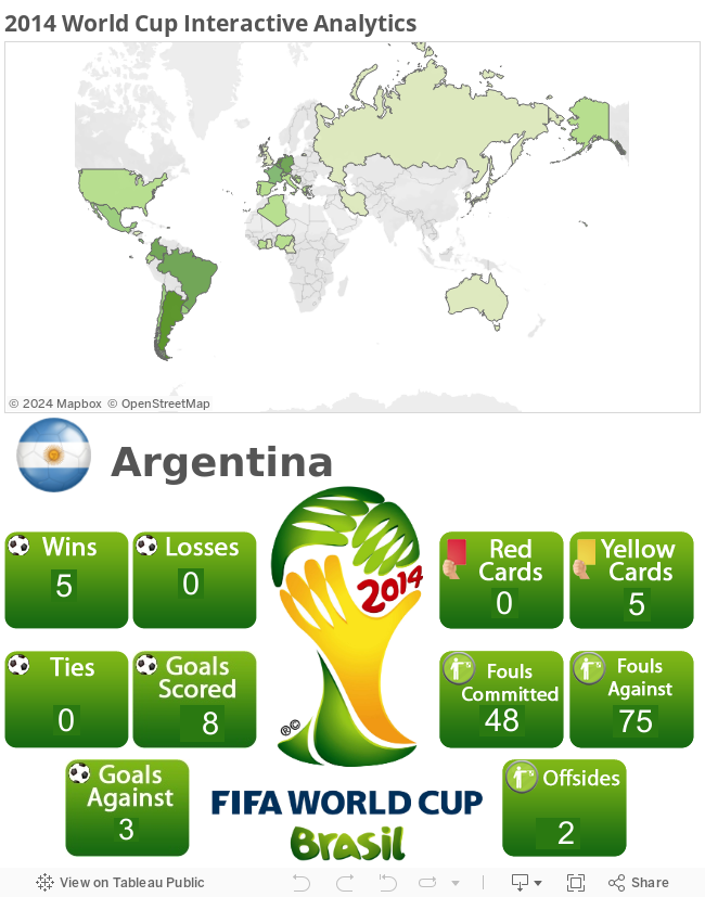
The “viz” above is more than just a bunch of static charts – a story unfolds, each country is denoted by its location on the map as well as flags. Hover over the country of your choice and get the data you want. It’s that flexible. Tableau users, download this report for free.

Make your predictions on the World Cup!

You now don’t have to guess who’s going to win strictly based on your favorite team, you now have the data to prove it! Who do you think will win the 2014 World Cup?

Message Sent

Thank you for registering.

Cardinal Path hosted a live session to connect with you and answer all your questions on Google Analytics.
Get all the expertise and none of the consultancy fees in this not-to-be-missed, rapid-fire virtual event.

Thank you for submitting the form.

Thank you for submitting the form.

Message Sent

Thank you for registering.

Message Sent

Thank you for registering.

Message Sent

Thank you for registering.

Message Sent

Thank you for registering.

Message Sent

Thank you for registering.

Message Sent

Thank you for registering.

Message Sent

Thank you for registering.

Message Sent

Thank you for registering.

Message Sent

Thank you.

Click here to download access the tool.

Message Sent

Thank you for registering.

Message Sent

Thank you.

Message Sent

Thank you.

Message Sent

Thank you

Message Sent

Thank you

Message Sent

Thank you.

Message Sent

Thank you

Message Sent

Thank you.

Message Sent

Success!
Your message was received.

Thank you.

Thank you for registering.

Cardinal Path is continuing with its series of free training. Next we are conducting training on Google Data Studio. Check it out here.

Message Sent

Thank you for registering.

Thank you for your submission.

Your request has been submitted and a rep will reach out to you shortly.

Message Sent

Thank you for your interest.

Thank you for registering.

You should receive a confirmation email from GoToWebinar with your unique webinar login information. If you do not receive this email or have trouble logging in to the event, please email asmaa.mourad@cardinalpath.com.

Thank you for subscribing!

You're now looped into the world's largest GMP resource hub!

Thank you for your submission.

Thank you for your submission.

Thank you for your submission.

Thank you for your submission.

Message Sent

Thank you for registering.

Message Sent

Thank you for your submission.

Thank you for your submission.

Message Sent

Thank you for registering.

Thank you for registering.​

Paid media spend by Government websites increased a whopping 139% YoY in 2020.

2020 Online Behavior Live Dashboard

Message Sent

Thank you for registering.

Message Sent

Thank you for registering.

Message Sent

Thank you for registering.

2020 Online Behavior Live Dashboard

Thank you for your submission.

Message Sent

Thank you for registering.

Message Sent

Thank you for registering.

Message Sent

Thank you for registering.

Message Sent

Thank you for registering.

Message Sent

Success! Thank you
for reaching out.